Ever dream of the perfectly decorated room but never get around to making that dream come true?
(Real Simple) -- Have you ever been in the middle of a DIY home decorating project and just stopped?
For whatever the reason--insufficient supplies, shortage of funds, lack of motivation, sheer exhaustion--your work just came to a halt. Sounds familiar, right? Whether a DIY home makeover involves major renovations or minor redecorating, it still requires your time, energy, and money.
The following Real Simple readers were caught in the middle of six very different room makeover projects that they never finished. That is, until our team of experts--armed with paint brushes and fresh ideas--came to the rescue.
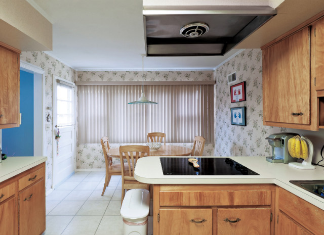
Amy and David's kitchen before.
MATTHEW WILLIAMS/REAL SIMPLE
Amy & David's kitchen: BeforeThe location: Rye Brook, New York
The "before" story: Amy and David Low moved into their split-level home last year with their children, Alli, now three, and Seth, six. "The kitchen looked like it hadn't been touched since 1959, when the house was built," says Amy, a stay-at-home mom. Weary wallpaper, countertops, and cabinets overwhelmed the room.
Why they stalled: "It just seemed like too much to take on," says Amy, so the couple "kind of ignored the kitchen" while David, a partner at an ad agency (who also happens to be handy), renovated other rooms.
What they hoped for: Amy envisioned a "light, bright" update that would make the kitchen a cheery center of family life.
Amy and David's kitchen after.
MATTHEW WILLIAMS/REAL SIMPLE
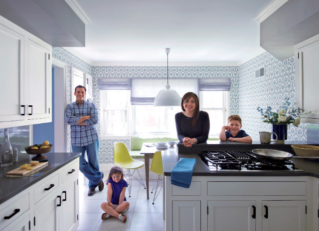
Amy & David's Kitchen: AfterPatterns, patterns everywhere: Fancy but fun wallpaper juxtaposed with green "fish scale" banquette upholstery and an oversize industrial pendant deliver eclectic cool. Eliminating the overhead exhaust (a downdraft vent on the cooktop replaced it) makes the room seem bigger and airier.
Cabinet about-face: New flush-mount doors on old painted cabinet frames feel fresh and sophisticated. Rich bronze handles are an earthy, distinguished touch; hardware is a worthy splurge in the kitchen, where it has such a strong visual presence.
Floors benefit from the company: The new palette—especially the play of gray countertops against white wood—makes the throwback linoleum tiles seem intentional.
Decked-out dining: Colorful, curvy chairs and a clean-lined wooden table are a nod to the kitchen's midcentury roots. The banquette, tricked out with hidden storage and vibrant, wipeable outdoor fabric, is space-efficient, crisp, and neater than having chairs on all sides of the table.
Glow without glare: Sleek sheer shades banish vertical blinds. Now plenty of filtered light comes through, and the less-than-stellar view can be muted at will.
Real Simple: Get where-to-buy information
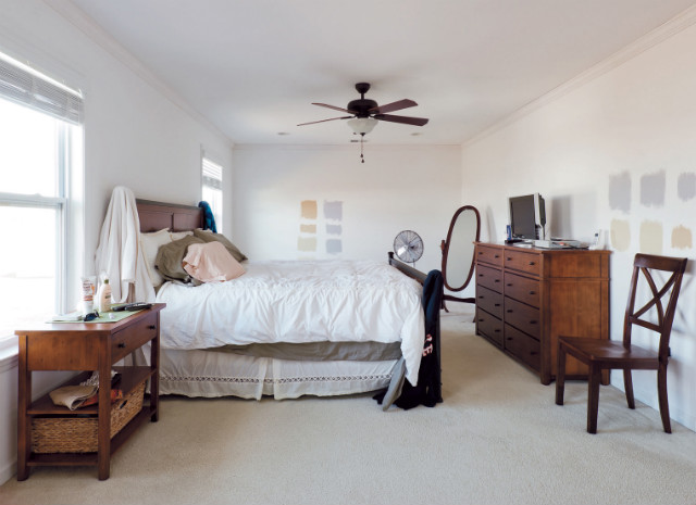
Susan and Joe's bedroom before.
MATTHEW WILLIAMS/REAL SIMPLE
Susan & Joe's bedroom: BeforeThe location: Bordentown, New Jersey
The "before" story: Susan Nyzio, a stay-at-home mom, and her husband, Joe, an Iraq War veteran who works for the Department of Military and Veterans Affairs, say decorating their room perpetually dropped to the bottom of their to-do list. After moving into their center-hall Colonial three years ago, "we bought a bedroom set, and that was kind of it," explains Susan.
Why they stalled: Paint swatches adorned the walls ever since, as life with their boys (Joey, almost three, and Grady, 10 months) went on.
What they hoped for: We didn't even really know what we wanted—we never got that far," says Susan. "But we thought it would be nice to have something serene and grown-up, because the rest of our house looks like Romper Room."
Real Simple: Double-duty decorating ideas
Susan and Joe's bedroom after.
MATTHEW WILLIAMS/REAL SIMPLE
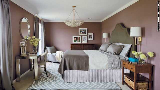
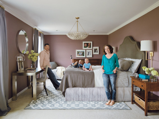
Susan & Joe's bedroom: AfterCocooning color: Moody walls in grayish lilac (gray-lac!) bring sophistication and drama without being too extreme. "We wouldn't have thought of this color, but we love it," says Susan. Framed family photos hung salon-style over the dresser add smiles (literally) as Susan and Joe enter the room.
Flipped floor plan: A new arrangement takes the bed to the opposite wall. (It's nicer to face windows than to have them at your back.) A big space like this one needs to be filled to look complete, hence the addition of a desk and a chaise, covered in a durable cotton for the kids.
A perfect (un)match: Breaking up the bedroom set is more modern than having every piece match. The nightstands and dresser stay, but an oversize upholstered headboard replaces the old bed. It makes the largest item in the room a style statement and decorates a wall that would otherwise demand art.
Sparkle for spirit: Brass, silver, and glass add livable glamour and keep quiet colors from feeling blah; sateen curtains hung high make windows seem grand and luxurious.
Stripes, circles, and diamonds: A mix of similar-palette prints (rug, sheets, bed skirt) brings personality to an elegant space, so it feels like home, not a hotel. Shells on the hanging fixture form an organic design of their own and cast dappled light when lit.
Real Simple: Get where-to-buy information
Real Simple: Color combinations for your home
Jill and Max's family room before.
MATTHEW WILLIAMS/REAL SIMPLE
Jill & Max's family room: BeforeThe location: Irvington, New York
The "before" story: A year ago, Jill Bannister, a nurse, and Selwyn "Max" Maxwell, a hospital administrative assistant, bought a small converted gatehouse whose charm was exceeded only by its repair needs: "The wiring, the roof, the gutters, the chimney—all had to be redone," says Jill.
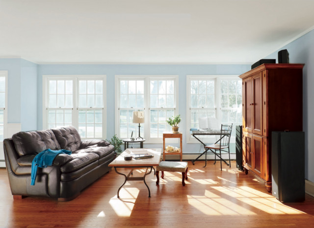
Why Jill and Max stalled: "After we painted the walls, we had no money left for anything else." The sunny family room featured huge bare windows and a handful of motley pieces, including a massive armoire for the TV.
What they hoped for: Jill longed to make the space cozy for homework (daughter Zoe is 12), watching sports, and entertaining friends.
Real Simple: 14 Living-rooms and dining-room makeovers
Jill and Max's family room after.
MATTHEW WILLIAMS/REAL SIMPLE
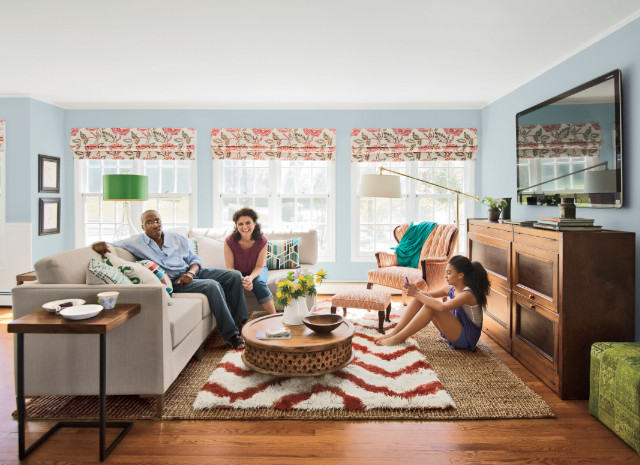
Jill & Max's family room: AfterSurround-seating: A sectional sofa creates instant togetherness, and a reupholstered flame-stitch chair adds a reading nook. Comfort reigns, with pops of teal, green, and orange bringing the casual space to life.
Campfire coffee table: Low and round, this centerpiece invites closeness as it softens the angles of the larger furniture. The foot-friendly furry rug makes the floor exciting. (Money-saving tip: Use a large, inexpensive sisal rug as a base, and layer it with a small version of the pricier rug you love.)
Windows with wow factor: Embroidered Roman shades add warmth and contrast—and function as art against understated blue walls.
TV pride: Unapologetic placement on the wall celebrates family viewing. The armoire, turned on its side and rehabbed, better complements the proportions of the low-ceilinged space. (A carpenter reconfigured the shelves and tweaked the doors so it would work horizontally.) The armoire's generous width makes the big screen (60 inches!) look right-sized.
Light touches: Two out-of-the-way lamps—located behind the sofa and the upholstered chair—illuminate the whole room after dark. ("You couldn't read in here before," says Jill.) A mobile side table can be pulled up to the sofa for snacking or laptop work.
Real Simple: Get where-to-buy information
Real Simple: New uses for things in the living room
No comments:
Post a Comment